Saturday, 21 May 2011
Communication and Interaction
The development of the OneVS device was a group project between myself and two other colleagues. Together we came up with a theoretical, futuristic, mobile communication device. The key aspect were that it was portable and hands free, eradicated the need for multiple media outlets and integrated the use of touch screen and holographic projection.
I was solely responsible for the colour choices and the design of a promotional poster and infograpic posters. The device would be available in three colours; electric blue, hot pink and lime green. Not only are these stricking but the idea was to appeal to male and female consumers and the choice of unisex. The Poster designs demonstrate using the lime green but there would also be electric blue and hot pink versions of the posters.
Saturday, 9 April 2011
Me, myself and I
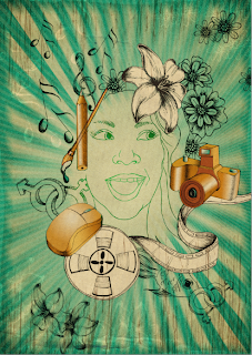
At the risk of looking a little self indulgent here is some work based on... you got it! ME!
The idea behind this was as a work in progress towards developing a self promotional website. The individual elements are intended to be Flash animated links to navigate various areas of my artwork (the camera would lead to my photography, etc.) All I have to do is learn Flash...
The final illustration is the closest thing to the final homepage design
Thursday, 31 March 2011
Saturday, 26 March 2011
Lifedrawing
Most of my work is mixed media and digital 2D illustration so i thought i would contribute some of my more traditional artwork by presenting some of my life drawing. Lifedrawing is something i have always enjoyed doing. There is something about the freedom, constantly learning new approaches and techniques and how the work is ever developing that aways captivates me. I could never get bored of the ever changing subjects
Here is some of my more recent colour work in lifedrawing
Sole Survivors
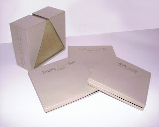
Sole Survivors Limited Edition Children's Audio CD Boxset
So the the title might be a bit of a mouthful but i assure you this was one of my more enjoyable projects. I tried to create a limited edition impression by using different tones of metallic gold for the packaging. However i feel the real treat is what the posh exterior contains.
Inside I created an array of rich, colourful illustrations for each audio CD - Walkabout By James Vance Marshall, Empire of the Sun by J. G. Ballad and Lord of the Flies by William Golding. Using earthy textures and colours and a range of mixed media and techniques, I developed complimenting designs for each story, all heavily influenced by the CD insert for The Counting Crows; August and Everything After, album artwork.
Friday, 25 March 2011
Dundee Rep Theatre Brochure
Dundee Rep Theatre is a exciting and diverse hub of creativity within the center of Dundee, playing an important part in the city's culture. This project was to design brochure covers promoting two of the theatre productions staging at the Rep - 'Death of a Salesman' and 'Catcher in the Rye'. I was keen to stay away from the usual promotional designs for these two classic productions, where we often see solitary, tormented figures. Instead i opted for symbolism. The renowned storyline's meant i could use very simple imagery to depict each play without loosing their meaning. I even tried to keep the illustration style simple using stencil techniques and a minimal choice of medium.
Wedding Brochure
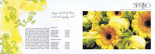
Being involved in floristry since a young age, i cannot help but feel passionate about the subject. Whilst working at a reputable, high end florist, i could not help but notice that despite having a broad portfolio of wedding work, the company price list brochure was worryingly lacking any style. Having a lot of pride in the job and the company i set out re-designing a more contemporary wedding brochure. I wanted something fresh and funky that reflected the identity of the business.
Using a mixture of clean white space, Digital Photography, Mixed Media and carefully laid out typography i set about designing and illustrating a new and improved wedding pricelist. Here are spreads from the autumn and spring pages.
Thursday, 24 March 2011
Royal Mail
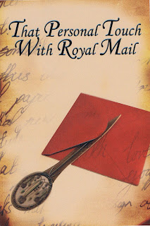
In the age of technology we have come to demand speed. Unfortunately this has resulted in a decline of the volume of mail being sent. Being a sentimental person myself i feel rather melancholy about this loss of the personal touch you get by sending and receiving hand written cards and letters. What a wonderful feeling it ca be to know someone has thought about you and cares enough to take time out of their busy life to sit down and write a hello!
For this Mailshot i used a quaint, traditional illustration style, reminding the recipient of how much we all love to receive personal, hand written mail. Hopefully this would encourage them to send out personal mail of their own.
Royal Mail Limited Edition Stamp Collection
One of my more interesting projects, filled with plenty of exciting imagery possibilities. Promoting the obscure Beltane Fire Festival - a festival held in order to celebrate the coming of spring, based around the seasons and the mythical creatures, there were a number of angles to approach the brief from. Being very inspire by colour and nature, i focused my designs on the seasons themselves, using fresh, organic illustrations and seasonal colours to show the importance of nature within this festival.
Fashion Illustration
This project was my opportunity to add something fresher and more modern to my portfolio of otherwise deep, rich, illustrations. The Fashion Illustration which is likely to attract my attention is often minimal and simplifies the reality of the female form, using precise lines and complimenting colour choices. These are the styles that i used for inspiration. The result - strikingly simple, feminine poster designs that help liven up my portfolio and hopefully show a broader side to my creativity.
GoodRaven
GoodRaven, a tale of love and witchcraft, based around 'The Witches of Salem'. The first book cover illustration was designed around the art directors instructions, including the use of five black candles in a candle holder. Using this for guidance, the brief for the second design allowed me free reign. Music to my ears! I chose to use rich, dark colours set behind the burning glow of the candle's flame to reflect the darkness and fear within the storyline. An innocent looking hand reaches out to extinguish the light as easily as the lives of the witches were taken away.
This was a great project to brush up on my Photoshop skills, using a combination of digital photography and mixed media.
Wednesday, 23 March 2011
Seven Deadly Sins
My initial dabbling in Digital Illustration... where better to start! Living a life fraught with the Seven Deadly Sins i could not help but become bewitched by the subject matter. What better way to convey such power feelings than through the eyes of a beautiful woman. Using colours traditionally emotive of these wicked emotions, i tried to create powerful and meaningful images while exploiting the simple beauty of a woman's stare.
Subscribe to:
Posts (Atom)


